.svg)

Overview
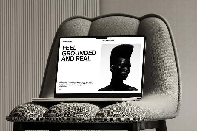
We worked with a B2B SaaS platform to redesign their product landing interface. The goal was to create a striking, high-contrast design that clearly communicated the product’s value, drove conversions, and differentiated them in a crowded software market.
Challenge
The app experienced a significant bounce rate and an ineffective task completion process. Users found it challenging to locate essential actions, and the visual design failed to instill the necessary trust that is vital in the fintech industry.
Our Solution
We conducted a full UX audit, user interviews, and competitive benchmarking. Our team redesigned the entire flow — from onboarding to dashboard — with simplified navigation, clear micro-interactions, and a bold, readable visual system optimized for mobile use.
Results
- 42% increase in user engagement within the first 3 months
- 30% reduction in onboarding time
- Boosted app rating from 3.4 → 4.6 stars on the App Store
- Positive feedback from users around clarity and trust

More Case Studies
A full UX redesign for a fintech startup, resulting in a 42% increase in user engagement.
Minimal, typographic site crafted to reflect honesty, clarity, and personal storytelling.
Have a Project in Mind
Let’s bring your vision to life—start your next project with us today.